The building that triggered this first index of Gehry’s international recognition also played a decisive role in consolidating his presence on the Los Angeles stage. The successful graphic designer Lou Danziger, whose innovative designs were popular in the museum world as well as in advertising, knew of Gehry’s work as he was on the board of the Faith Plating Company, for which he had designed a new building in 1963-1964. Together with his wife Dorothy, Danziger had initially commissioned his colleague and friend Frederick A. Usher, a “very charismatic guy”, with whom Gehry had worked at Victor Gruen’s office, according to Greg Walsh, Gehry partner of many years.2 Usher asked him to take over the design.
Este edificio, el cual propició el primer reconocimiento internacional de Gehry, también desempeñó un papel decisivo en la consolidación de su presencia en la escena de Los Ángeles. El exitoso diseñador gráfico Lou Danziger, cuyos diseños innovadores eran populares tanto en el mundo de los museos como en la publicidad, conocía el trabajo de Gehry, ya que formaba parte de la junta directiva de la Faith Plating Company, para la cual Gehry había proyectado un nuevo edificio entre 1963 y 1964. Junto con su esposa Dorothy, Danziger había encargado inicialmente el proyecto a su colega y amigo Frederick A. Usher, un “tipo muy carismático”, con quien Gehry había trabajado en el estudio de Victor Gruen, según Greg Walsh, socio de Gehry durante muchos años. Pero Usher pidió a Gehry que se hiciera cargo del proyecto.
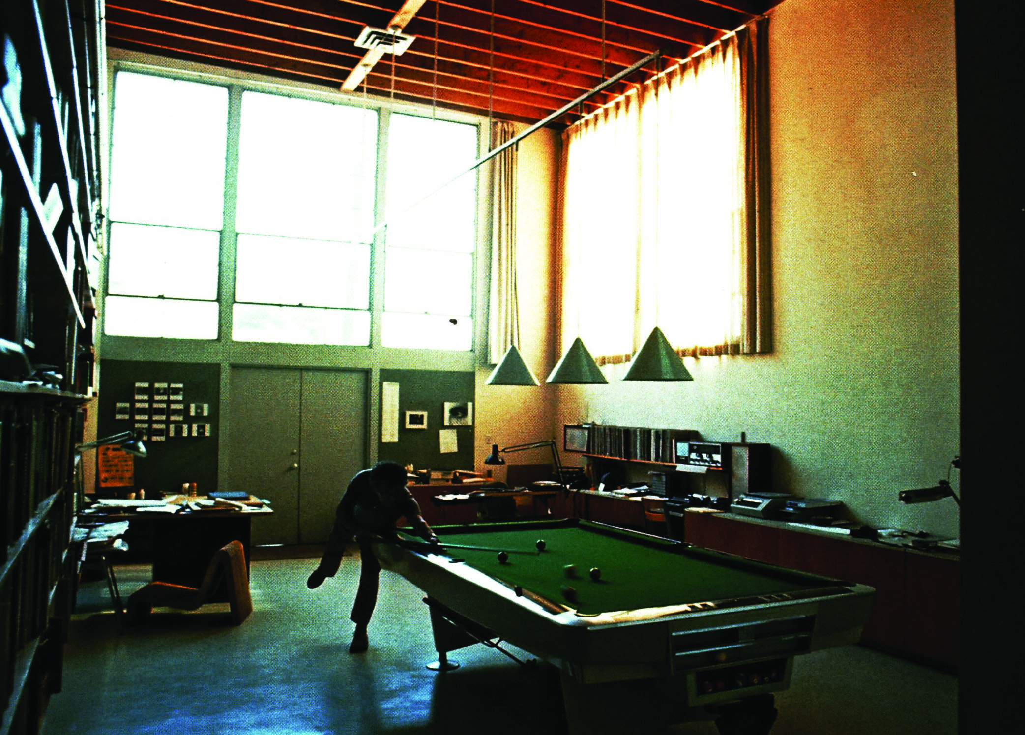
Lou Danziger claimed credit in retrospect for the initial concept: “I sat down and worked out a floor plan and made a little wooden model of my project, essentially the basic concept with the two offset cubes. I brought the model to Frank and said, ‘Frank, can we do this for $30,000 in three months?’ Frank looked at it and said yes. Those were the days! I had given him the basic scheme, but then he did wonderful things with it.” But Gehry recalls: “So I met with Louis and Greg Walsh was with me and we worked on a studio. He wanted to live there and then have a studio. He was going to hire an assistant – he was expanding his office. He wanted a library.”
Lou Danziger se atribuyó retrospectivamente el mérito del concepto inicial: “Me senté, dibujé un plano y construí una pequeña maqueta de madera de mi proyecto, básicamente el concepto con los dos cubos desplazados. Le llevé la maqueta a Frank y le pregunté: ‘Frank, ¿podemos hacer esto por 30.000 dólares en tres meses?’ Frank la miró y dijo que sí. ¡Qué tiempos aquellos! Yo le había dado el esquema básico, pero luego él hizo cosas maravillosas con él”. Sin embargo, Gehry recuerda: “Me reuní con Louis; Greg Walsh estaba conmigo y trabajamos en un estudio. Él quería vivir allí y tener un estudio. Iba a contratar a un asistente; estaba ampliando su oficina. Quería una biblioteca”.
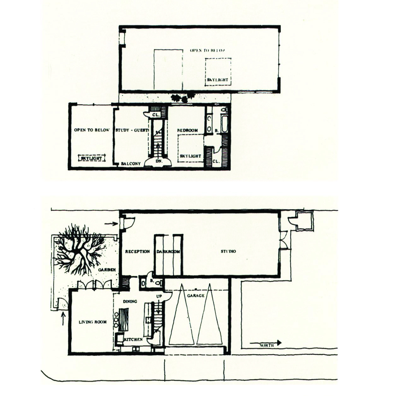
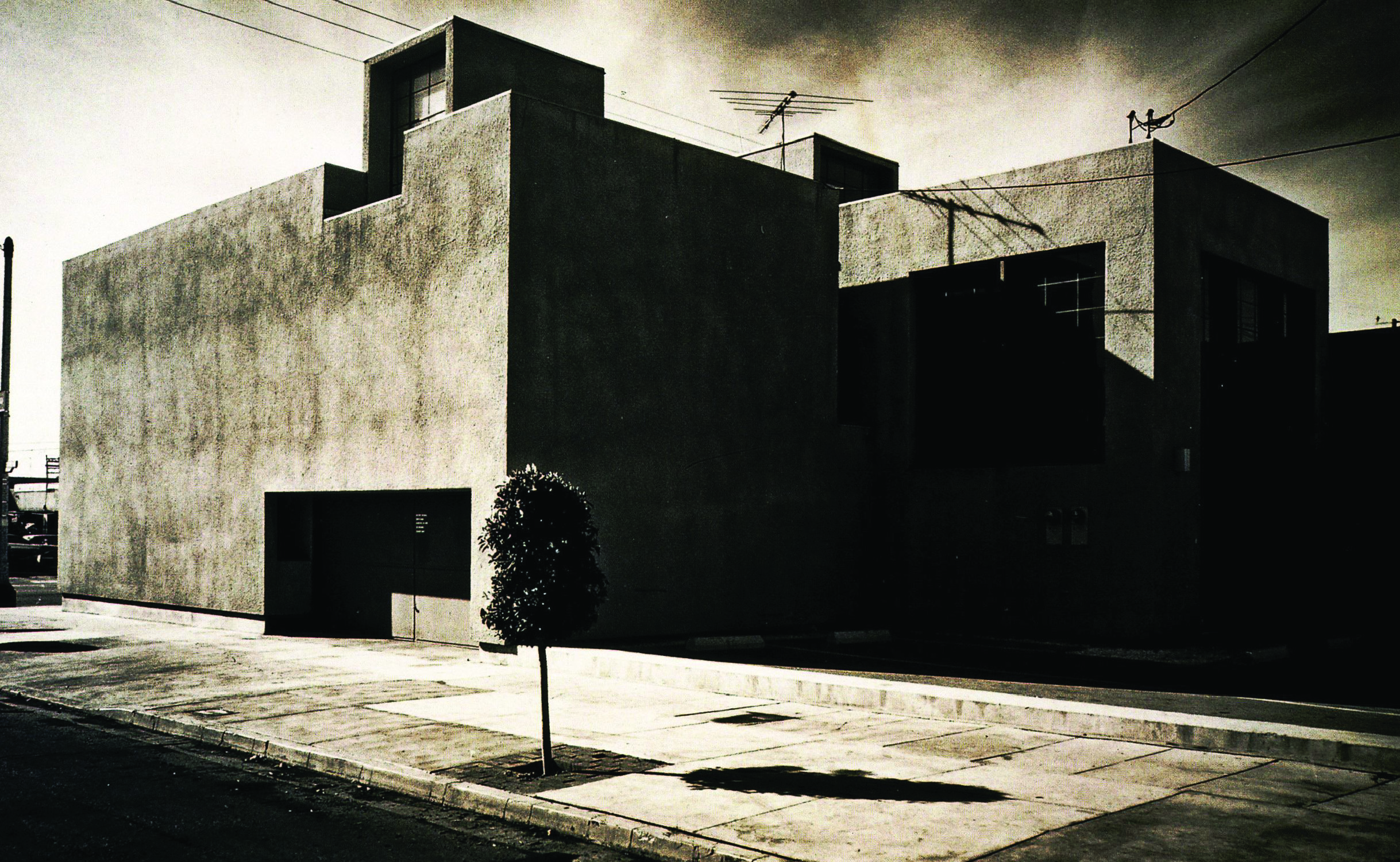
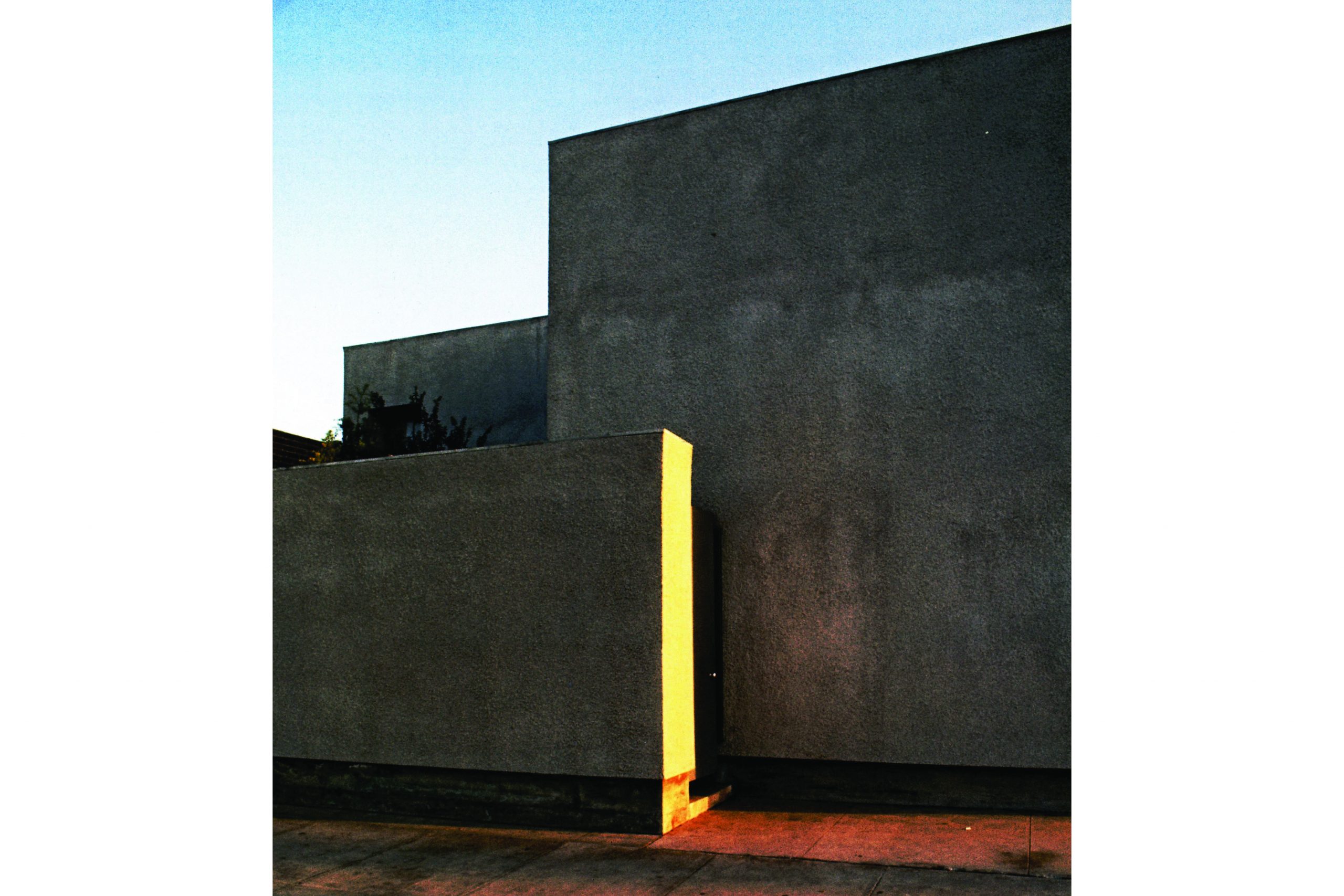
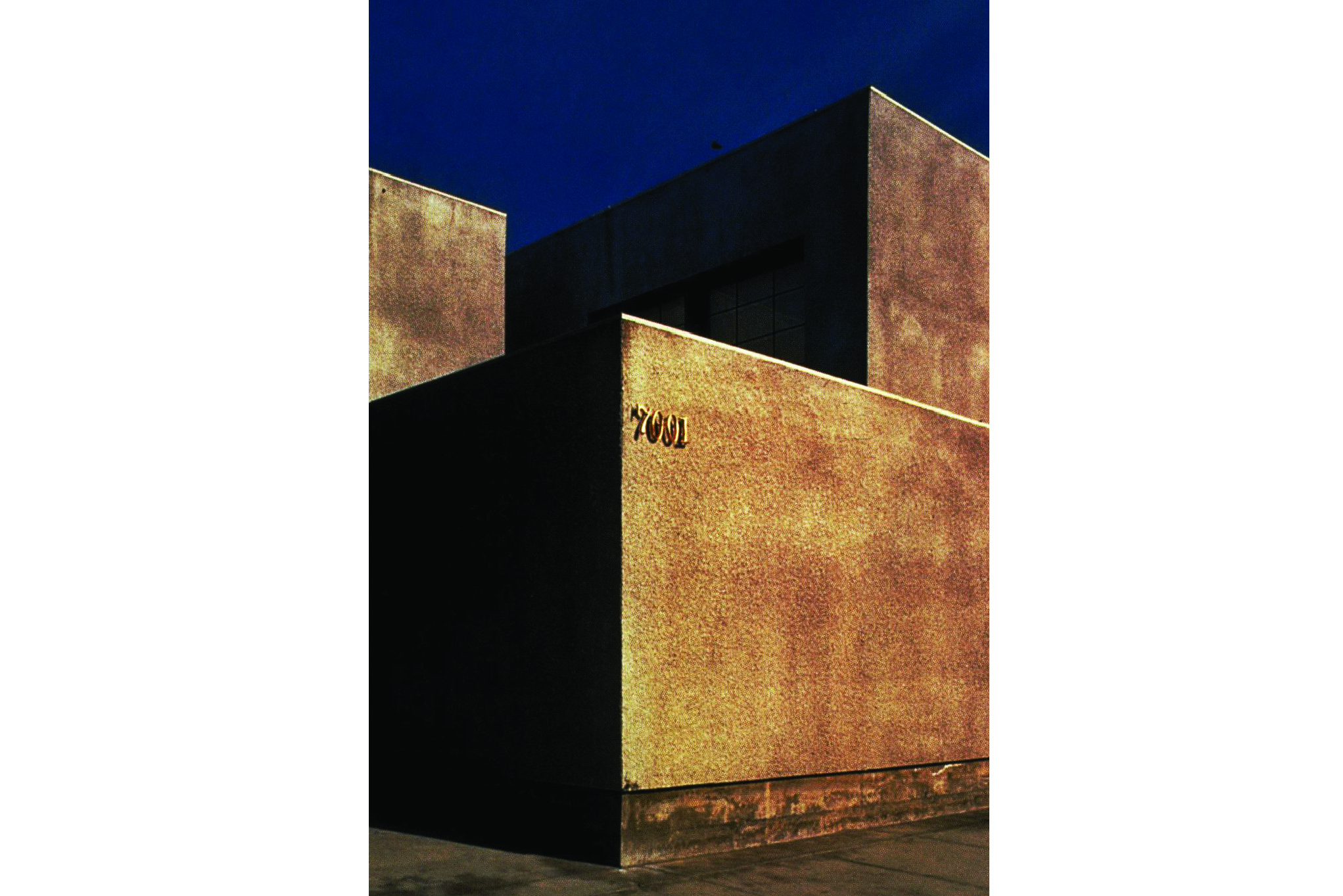
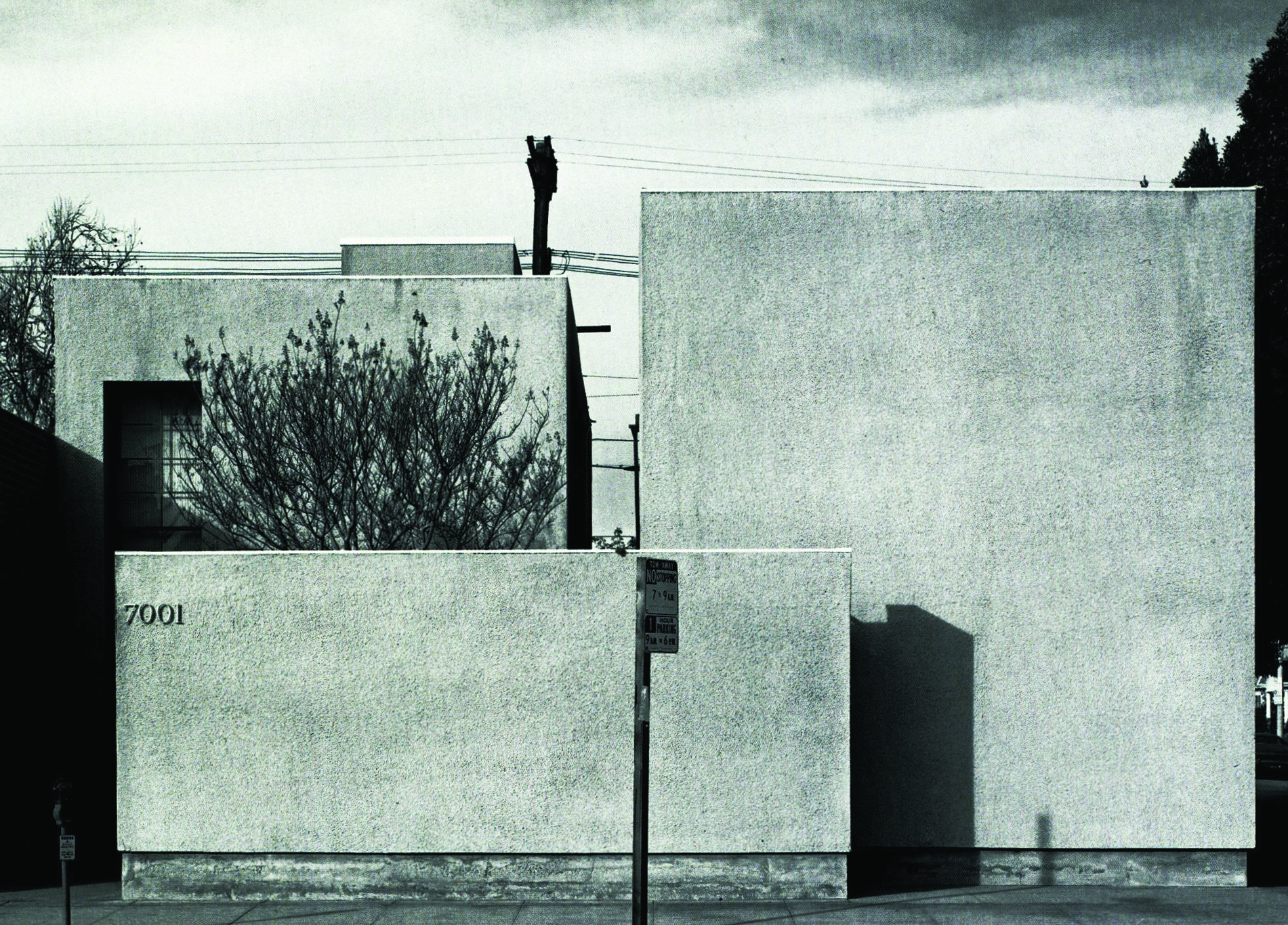
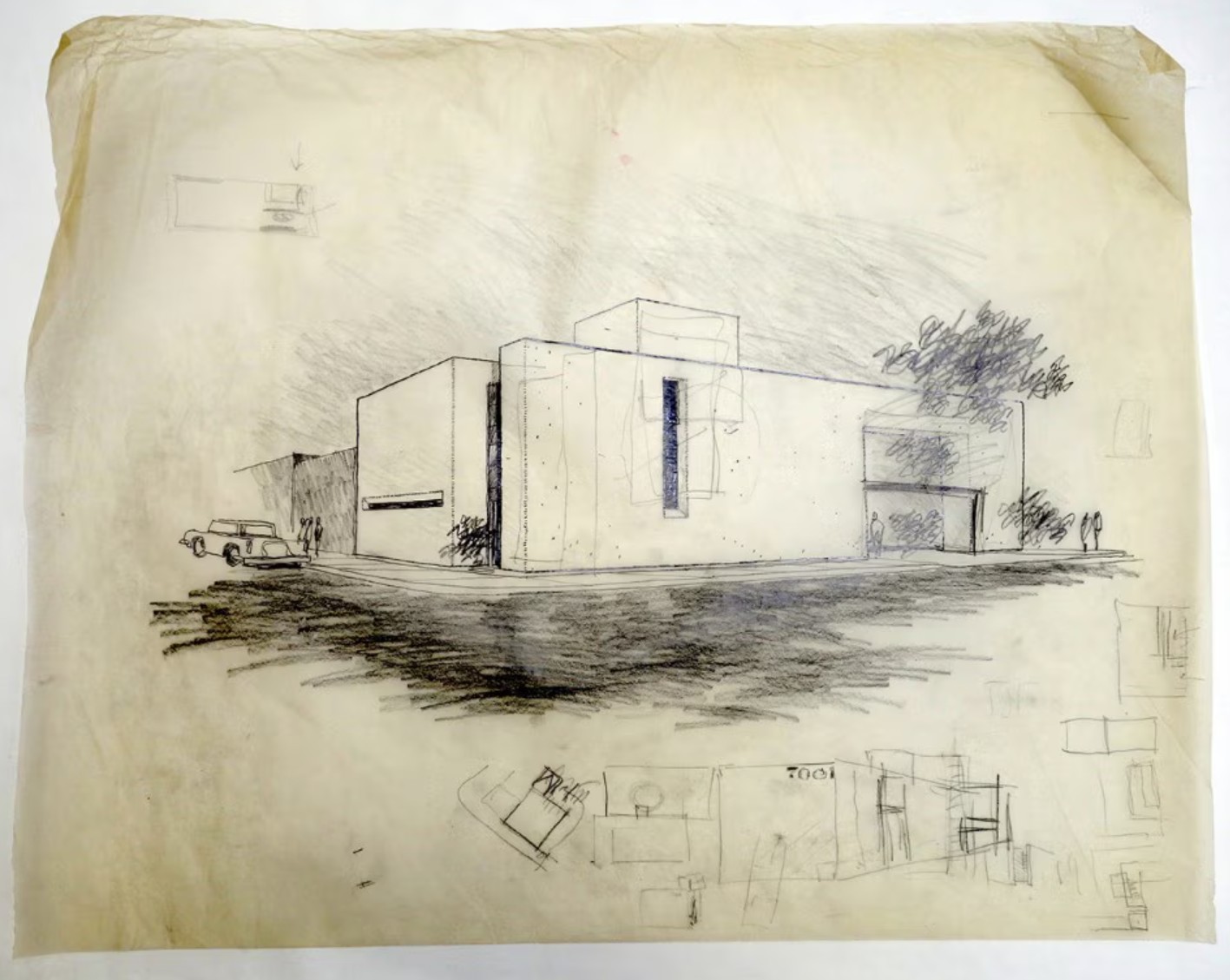
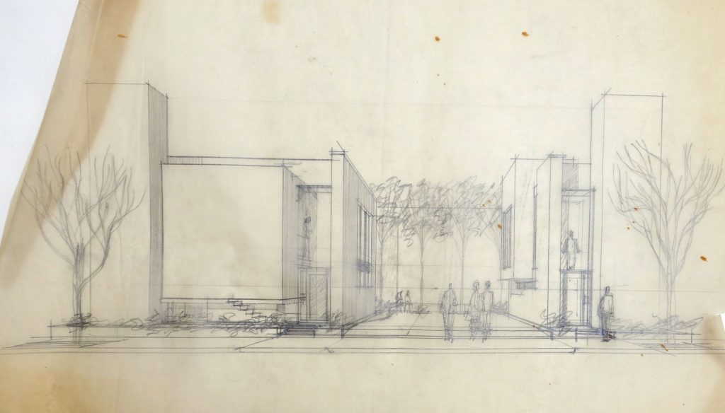
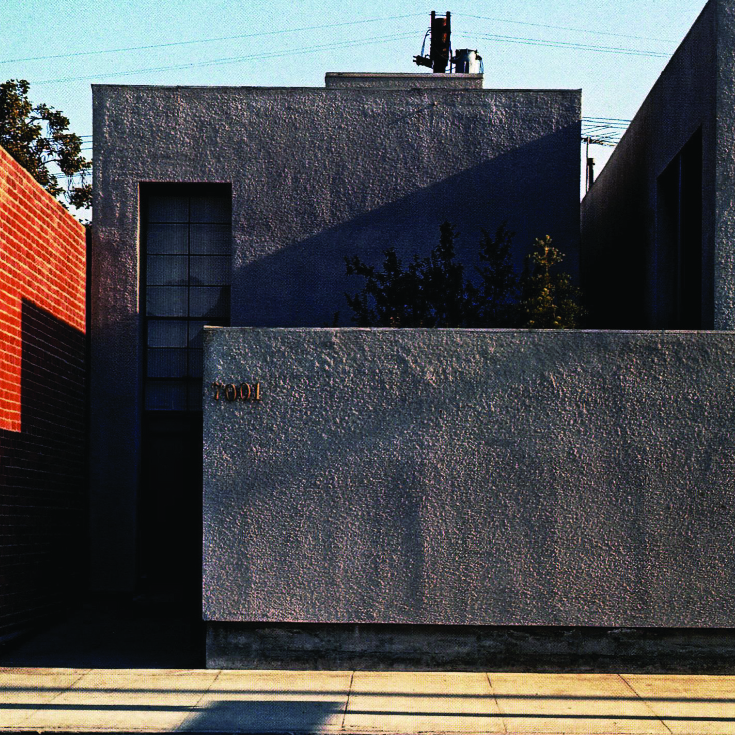
On a busy corner of Melrose Avenue, in a neighbourhood where printers and other businesses of the graphic trades abounded, Danziger’s idea was thus to build a 1,000-square-foot studio along with the 1,600-square-foot townhouse, contained in a single building. The first sketches reflect this unitary principle. Walsh affirms that “the big epiphany for me was when we pulled the two elements apart. For the first time we had two pieces on a single site.” From the beginning, the pressure of traffic in this area of Hollywood led to enclosed volumes, with a minimal number of windows opening directly onto the roads. The narrative written in 1970 by the office to support the application to an AIA Award is explicit: “The dirty, noisy and totally public nature of the surroundings necessitated completely introverting and screening the building from the street. The solution was a fortress-like structure, recessed from the street, with the residence portion sequestered behind a high wall.”
En una concurrida esquina de Melrose Avenue, en un barrio donde abundaban imprentas y otros negocios de artes gráficas, la idea de Danziger era construir un estudio de 93 metros cuadrados junto con una casa adosada de 149 metros cuadrados, todo ello en un mismo edificio. Los primeros bocetos reflejan este principio unitario. Walsh afirma que «la gran revelación para mí fue cuando separamos los dos elementos. Por primera vez teníamos dos piezas en un mismo terreno». Desde el principio, la intensidad del tráfico en esta zona de Hollywood llevó a diseñar volúmenes cerrados, con un número mínimo de ventanas que dieran directamente a la calle. El texto escrito en 1970 por el estudio para respaldar su candidatura a un premio del AIA (Instituto Americano de Arquitectos) es explícito: «La naturaleza sucia, ruidosa y totalmente pública del entorno hizo necesario que el edificio se orientara hacia el interior y se aislara de la calle. La solución fue una estructura similar a una fortaleza, retranqueada de la calle, con la parte residencial resguardada tras un alto muro».
Excerpt by Jean-Louis Cohen at Domus (August 2023).